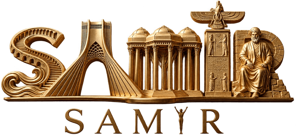
The Art and Philosophy of Corporate Trophy Design
Why material choice and custom form matter when an award has to carry an organization's reputation for years.
A trophy is never just an object on a shelf. It is the moment a name is called, the pause before applause, and the proof that a year of work mattered. That is why designing one is closer to writing a short story than to manufacturing a product.
Form should follow the story
Before we open a sketchbook, we ask three questions: what is being celebrated, who is standing on stage, and what should the room remember the next morning? A national science award and a corporate sales prize can share a budget and still deserve completely different silhouettes.
A good trophy is readable from the back row of the auditorium.
Material is a language
Brass reads as permanence. Walnut reads as warmth and craft. Acrylic reads as speed and modernity. When we combine them, we are writing a sentence rather than stacking ingredients. The weight of the base, the temperature of the metal and the reflection of the finish all speak before the engraved text is read.
The details people touch
Awards are handled more than they are admired. The underside of a base, the chamfer of an edge and the balance in one hand decide whether the piece feels considered. We finish every surface a palm can reach, even the parts the camera never sees.
Designing for translation
Many of our projects travel between languages. A bilingual engraving needs breathing room, mirrored layout decisions and typography that respects both scripts. We treat that as a design constraint from the first sketch, not as an afterthought in production.
A practical checklist
- Confirm the engraving text and both language versions in writing.
- Choose the base material before the top form; weight drives the whole composition.
- Match the finish to the lighting of the venue.
- Order a material sample before production begins.
If you are planning an award for next season, the best time to start is while the event is still a paragraph in a document. That is when the story is still flexible enough to become a beautiful object.